McKinney-Vento is a federally mandated training program that requires school districts across the United States to ensure their staff complete compliance courses related to supporting children experiencing homelessness. The existing WordPress-based LMS had become a ceiling - its structural restrictions made onboarding unnecessarily complex, reporting unreliable, and administration heavy.
The client needed a fully custom platform built around the actual complexity of their user base: multiple roles, multiple tiers of geography, and thousands of users who needed to get into training with as little friction as possible. We took the product from concept through a fully prototyped, design-system-backed solution that removes every stop point from the user experience.
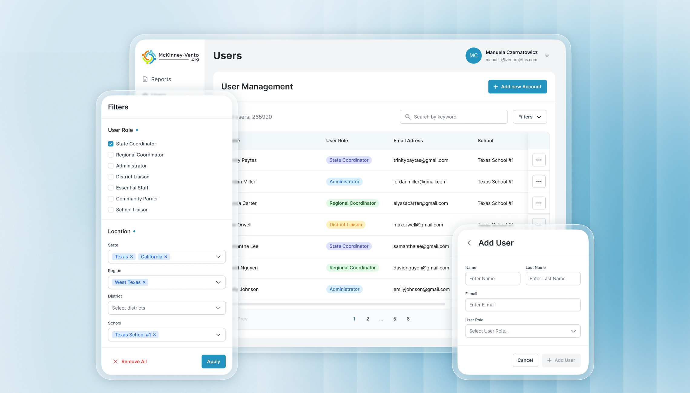
WordPress gave the client a starting point, but it was never the right tool for this product. Registration required email verification, domain validation, and multiple forms for different user types - each one a potential drop-off point for essential school staff who were not technically confident and had no reason to persist through friction. On the administrative side, coordinators at the state, regional, and district level had no reliable way to track compliance progress in real time.
The client's goal was precise: replace every unnecessary step with a deliberate, guided action, and provide administrators with the reporting visibility they needed to manage compliance across thousands of users in dozens of states. That meant designing a product from the ground up - not patching what already existed.
We designed a complete LMS platform that included:
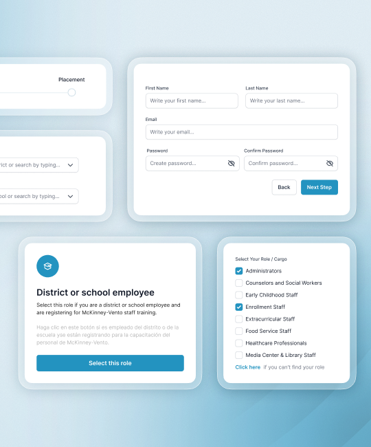
- A passwordless, magic-link login system and a tiered registration flow (state → region → district → school) with unique registration URLs per location - eliminating email verification and complex forms entirely.
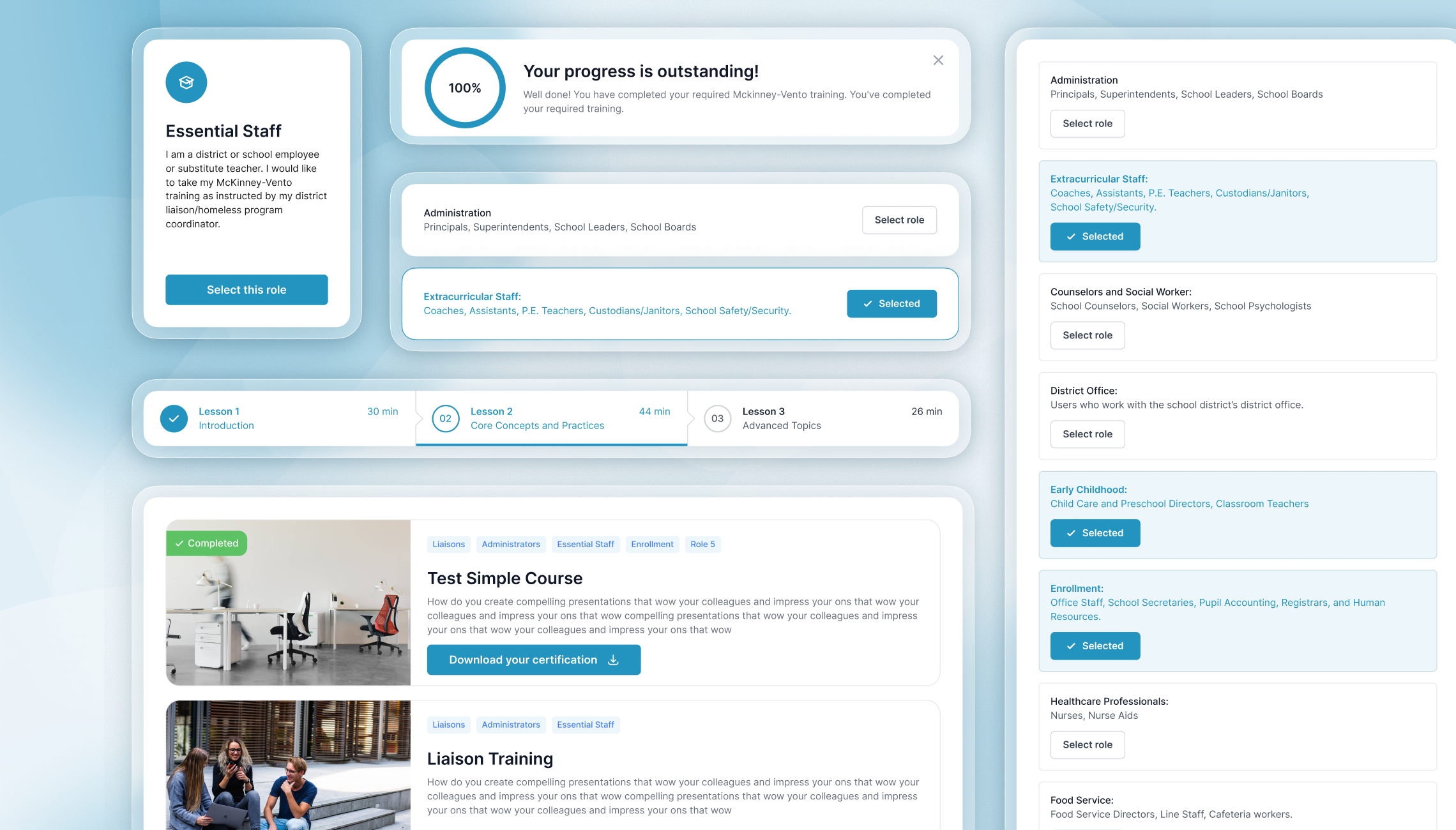
- A role-based onboarding experience covering Essential Staff, District and School Liaisons, and Community Partners - each with a guided, step-by-step registration path tailored to their position.
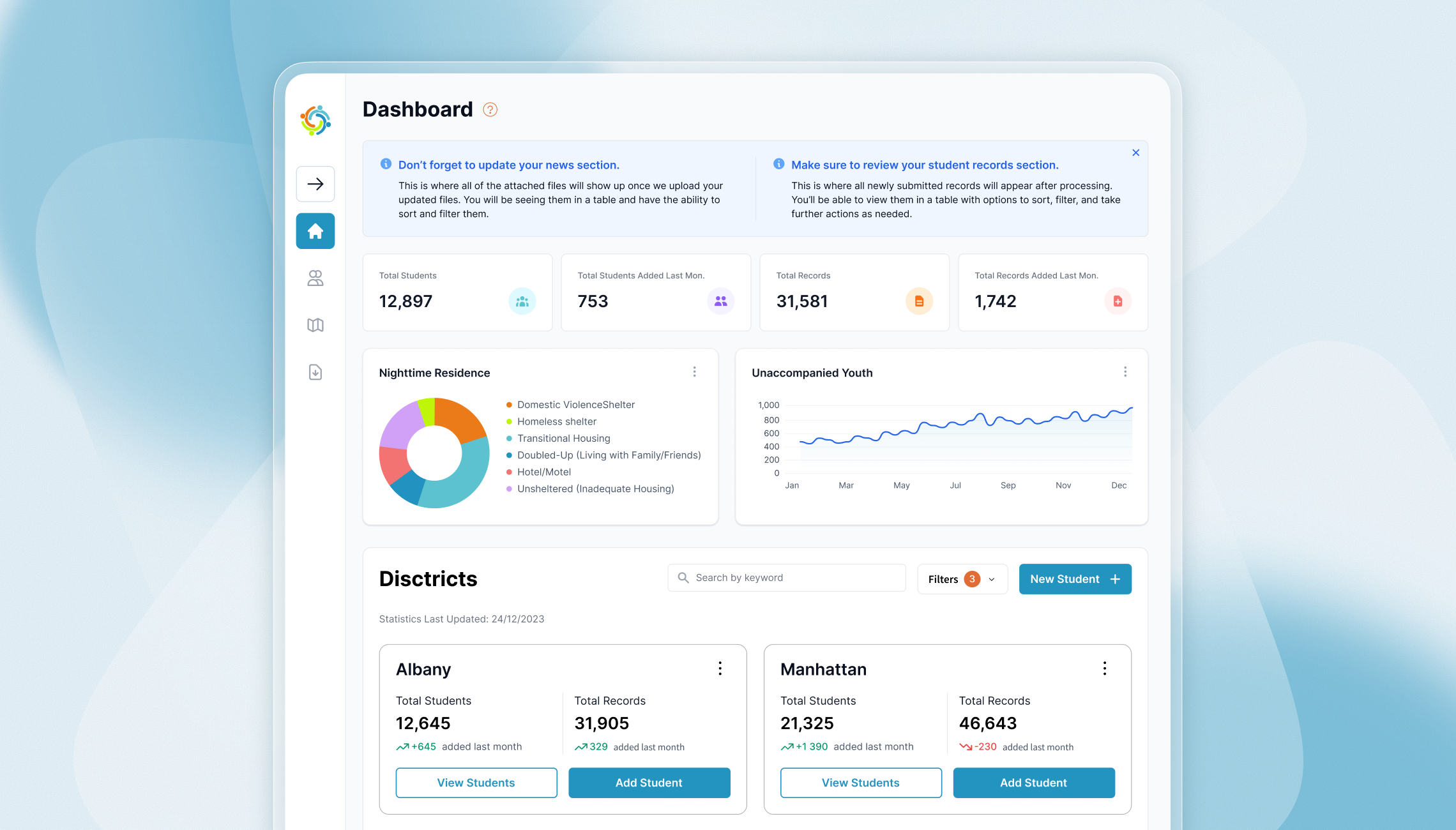
- A learning dashboard displaying role-specific mandatory and optional courses, with completion ribbons, time-tracking, and automated certificate generation and download.
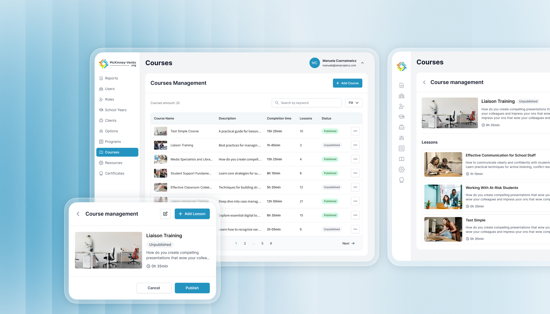
- A course management system supporting multiple section types - text, video, file, HTML/SCORM embeds, and quizzes - with minimum time enforcement per lesson to meet professional development credit requirements.
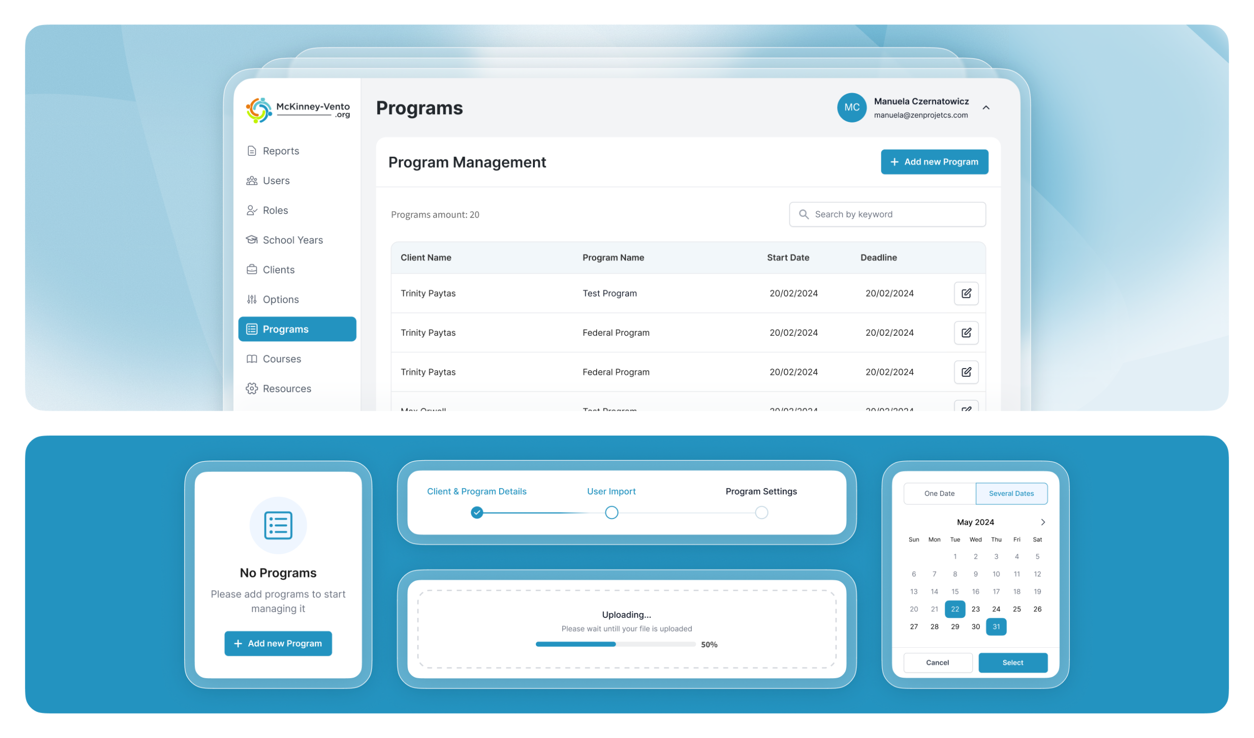
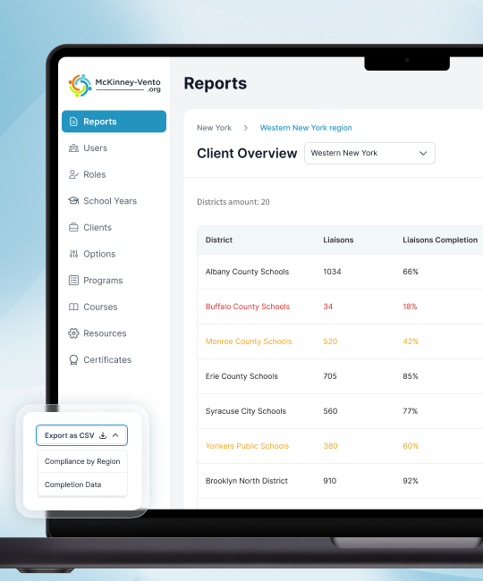
- A four-tier compliance reporting dashboard (State, Regional, District, School) with real-time completion tracking, districts-of-concern flagging, and CSV exports for coordinators at every level.
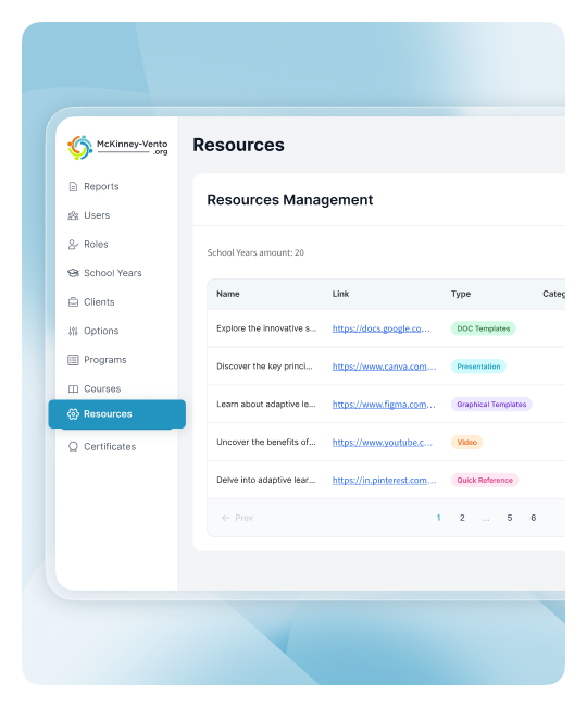
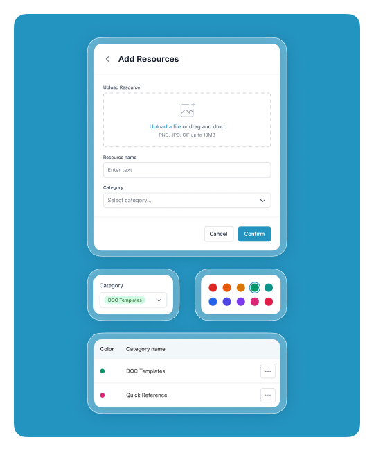
- A resource library for liaisons with category filters and search, and a program management system for running structured training campaigns across multiple districts with automated email reminders and deadline tracking.
The central UX challenge was that the platform served fundamentally different users - a school bus driver registering for the first time and a state coordinator monitoring compliance across hundreds of districts - within the same product. Our Discovery phase focused on mapping every user role and their critical path through the platform, identifying where the existing WordPress system created unnecessary decisions and where users had historically dropped off.
The registration flow became the first major design problem to solve. Rather than a single form that tried to serve everyone, we designed a cascading location-based flow that routes each user to exactly the right registration experience based on their geography and role - with no dead ends and no ambiguous choices at any step. Every screen was built with the assumption that the user should never have to wonder what to do next.
The registration system required the most careful structural thinking on the project. With users spread across states, regions, districts, and schools - each with different roles and different course requirements - a single misstep in the information architecture would create support volume the client could not sustain.
We mapped the full decision tree during the UX Strategy phase before any UI work began, defining exactly how the system routes users based on their location tier and role selection. The result is a flow where every user - regardless of technical confidence - reaches their learning dashboard in the minimum number of steps, with contextual guidance at each point and a clear escalation path if they cannot find their school or district.
The compliance reporting hierarchy was the second major design challenge. Coordinators at each tier needed to see exactly the data relevant to their authority - no more, no less - with the ability to drill down into lower tiers on demand. We designed the reporting dashboards as a connected system, where a state coordinator can move from a state-level compliance overview into a regional breakdown and down to an individual district, following the data to where action is needed.
The districts-of-concern flagging - automatically surfacing school districts below 20% completion within one month of their launch date - was a specific administrative pain point we solved through proactive data presentation rather than requiring coordinators to manually scan results.
We delivered a full design ecosystem that transformed a raw concept into a strategic business asset. This package included a breakdown of all platform features, high-fidelity mockups for both desktop and mobile views, and a documented design system. We made sure every screen had clear developer notes, especially for the multi-user task transitions.
By creating this centralized hub, we gave the client a product that acts as a strategic asset, significantly improving the daily lives of families managing long-term care while keeping the brand feeling professional and reliable.
The design system and component library give the development and support teams a reliable foundation to maintain and extend the platform as the program grows to new states and client tiers.
